Nutramins™ live well grow better
Nutramins™ is a new line of nutritional supplements that focus on wellness provision, combined with effective age management. All supplements are based on Branded Ingredients, which are a revolutionary scientific approach on natural ingredients, empowered by the knowledge of advanced medicine techniques.
Designing the brand’s identity was challenging enough, as the end-result had to be immediately recognizable as pertaining to the category and at the same time differentiated enough against practically thousands of alternatives.
The key visual is clearly inspired by the very familiar capsule shape, so characteristic of the category. This is what the eye registers at first contact. Following that, we see the two-shade lines define an ‘n’ and an ‘a’, the key letters of the name. The shape finally includes a ‘plus’ sign, referring to the positive effect of the products on one’s health.
Category-specific yet unique enough and conveying the right messages to all audiences in a clear manner, the logo is a powerful companion to a brand that aims high.
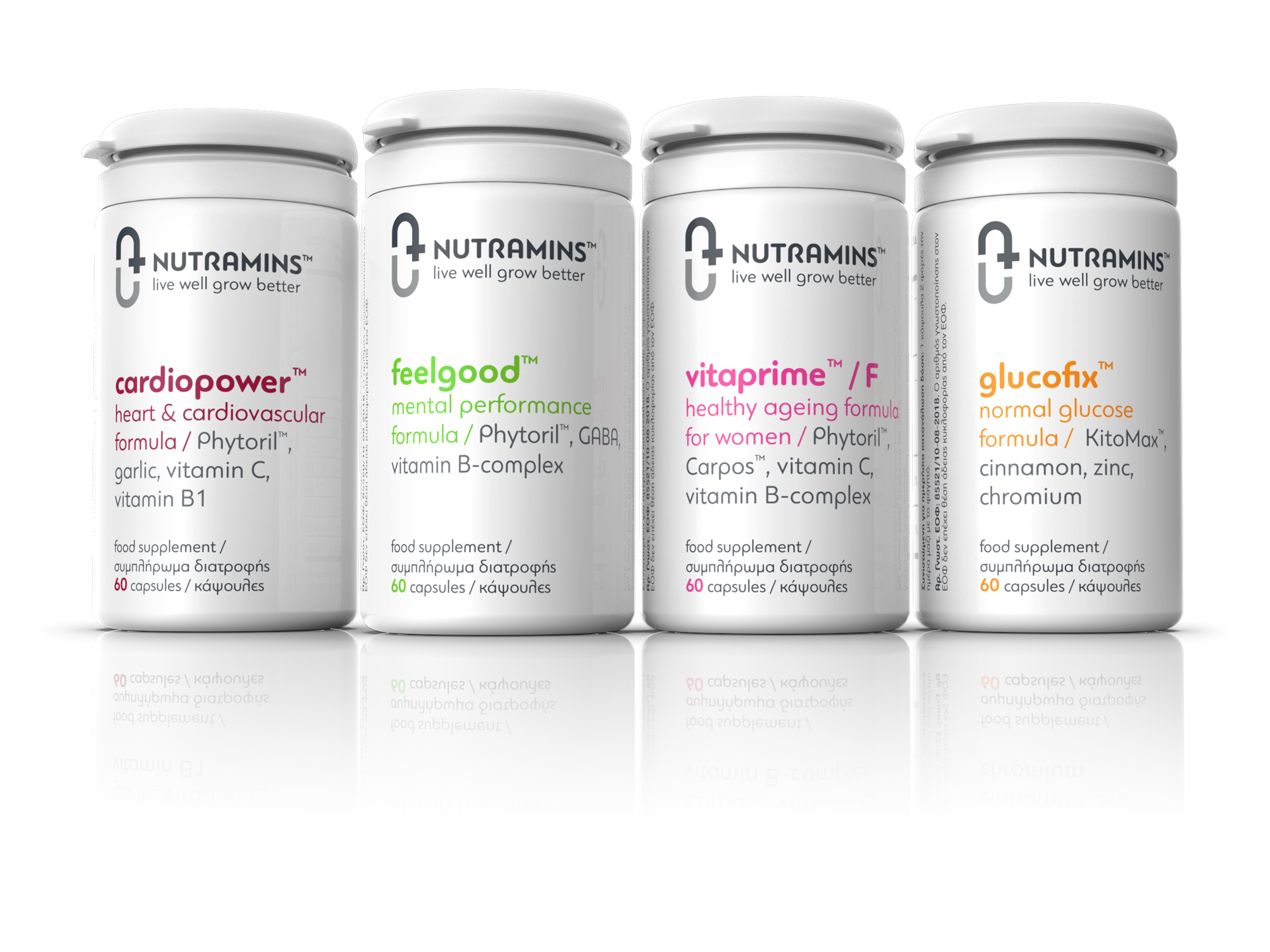
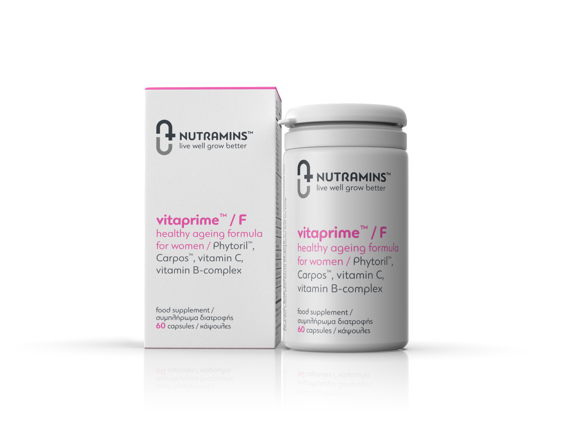
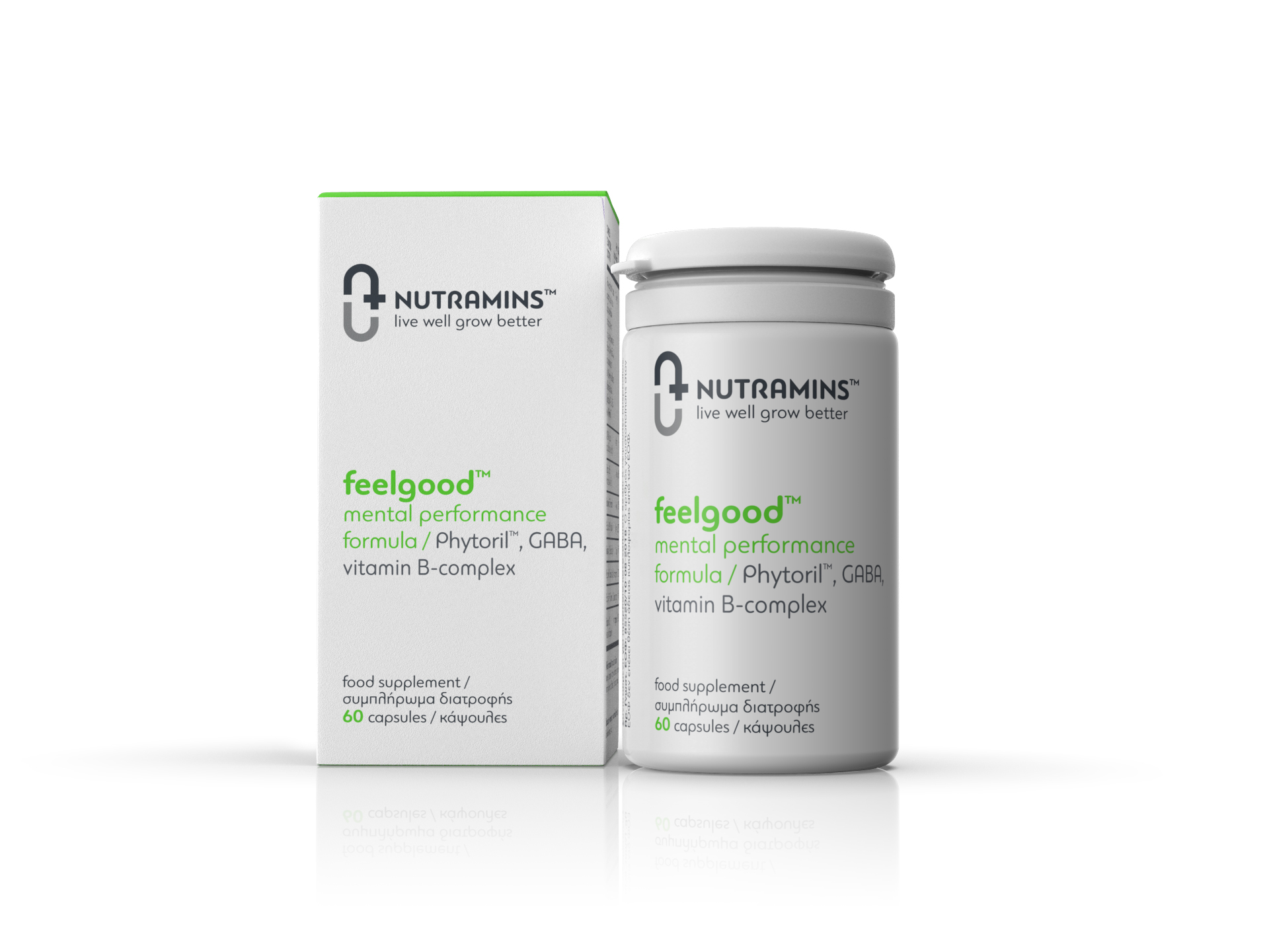
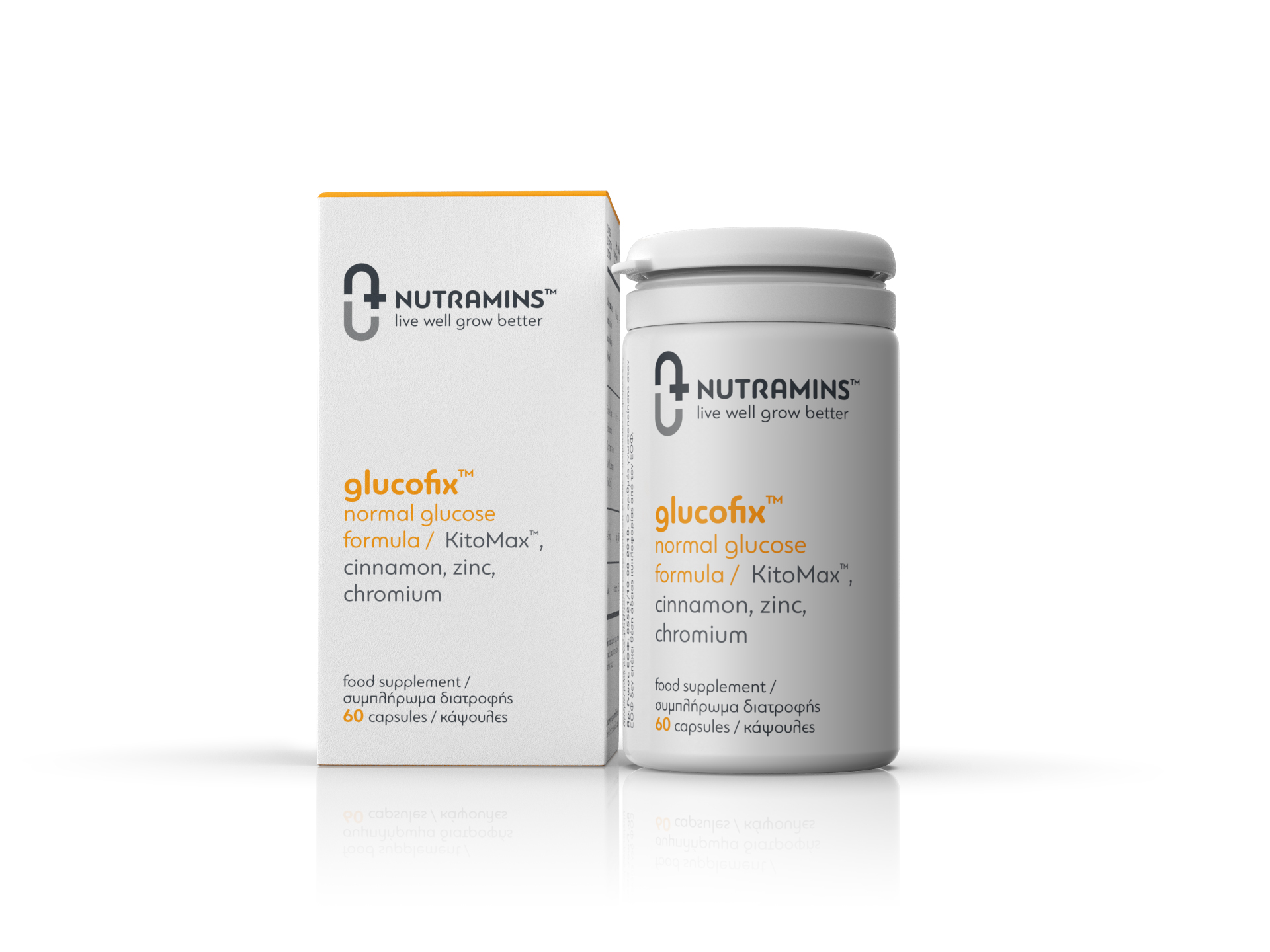
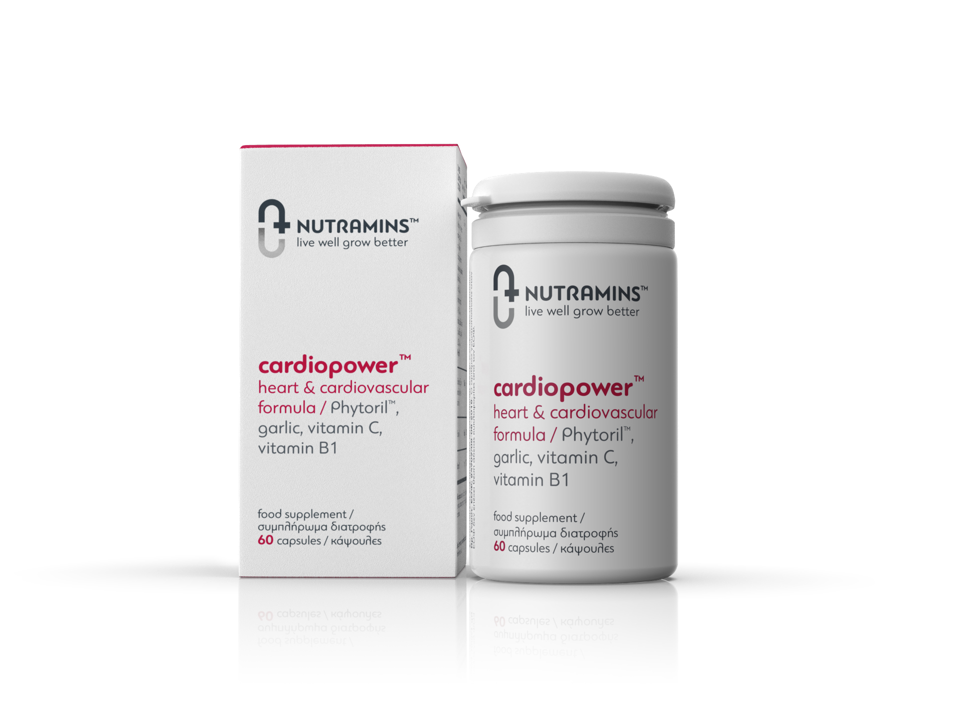
Supplements’ names: FeelGood™, Cardiopower™, Glucofix™, Vitaprime/F™, were created with the intention to deliver a powerful, direct message to the consumer regarding the supplements’ beneficial action while the company’s name Nutramins™ derives from the combination of the word “Nature” and the suffix “–mins” that is a reminder of the word vita-mins.
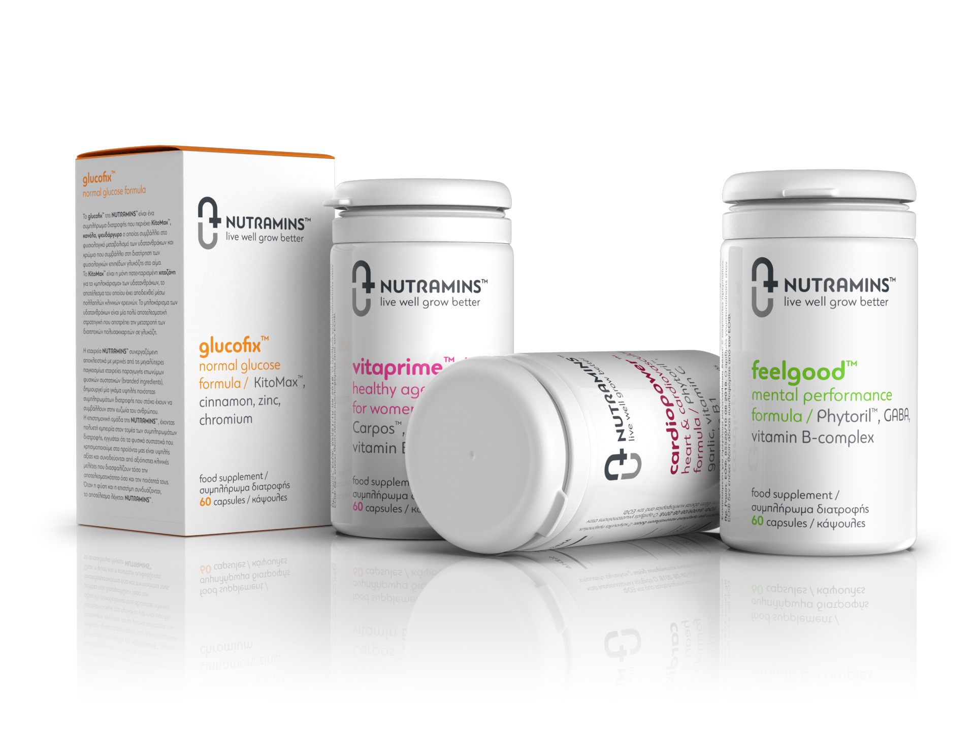
Packaging design follows the same concept of directness and purity as we did with the brand naming in order to emphasize on the science behind the supplements and company's medical know-how.
This led us to an extremely clean and modern design that focuses in the medical aspect of the products. The white color was used as a canvas to help the supplements’ colored names stand out and deliver their messages. Overall, the artistic treatment has a “quite power” attitude that, we believe, differentiates the brand from the rest and makes the consumer understand that is a worth trusting nutraceutical solution for his nutritional needs.


